Independent designer specialising in Brand Identity, Websites and Type Design in the fields of Fashion, Ecommerce, Technology & Startups, Arts & Culture. Based in Europe, CET. Email → robert@tomanstudio.com
Selected Works

MUZIKER
Brand Identity for E-Commerce Focused on Free Time Activities
Muziker is an e-commerce store selling over 7800 brands in 31 countries. Their main focus is selling products related to free time activities. Their main problem was a lack of consistent brand identiy. Brand assets they were using were generic and looked a lot like a competition. In other words, they were helping their own competition with a lack of distinctiveness. We crafted a simple yet distinctive identity based on a brand (multi)character MuzMuz and a solid color that doesn't exist in the segment.
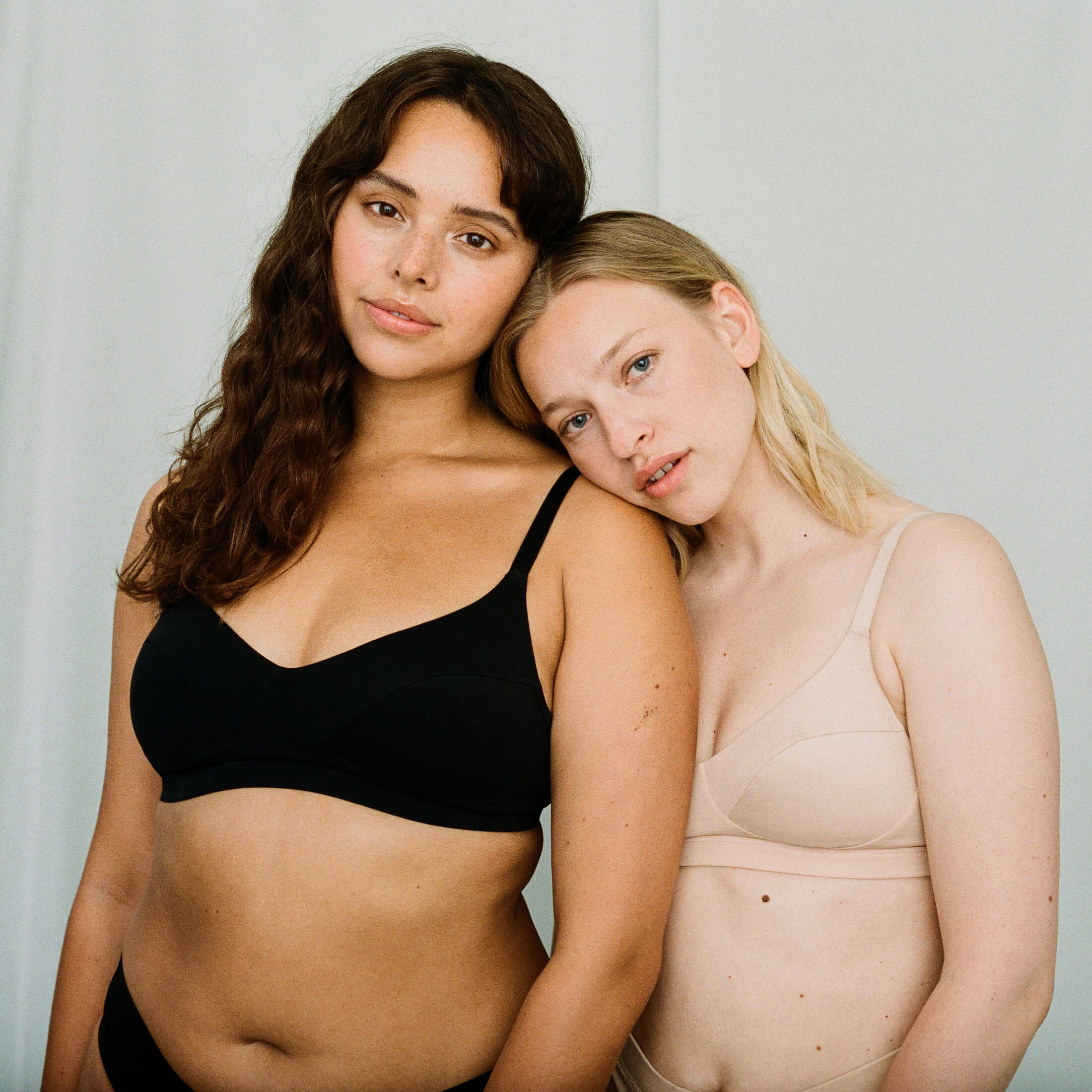
ORGANIC BASICS
Website Design For a Leader in Sustainable Apparel
Organic Basics is a renowed sustainable apparel company founded in Denmark in 2015. During my time at Organic Basics (2019—2021), I focused on creating an exceptional e-commerce experience. Alongside this, I designed a proprietary system to showcase the environmental impact of each product, empowering customers to make informed choices. These initiatives aimed to elevate Organic Basics' brand and enhance the overall customer experience.

RIM REBELLION
Brand Identity For Premium Cycling Store
Rim Rebellion is an online store that specializes in cycling apparel. It offers a wide range of stylish and high-performance clothing and accessories for both men and women, focusing on items like jerseys, sunglasses, jackets, gloves, and more. But it doesn't end there. Rim Rebellion aims to be a cycling club, connecting the like-minded enthusiasts and professionals of the sport.
Back Catalogue
Field
Project
Description
Discipline
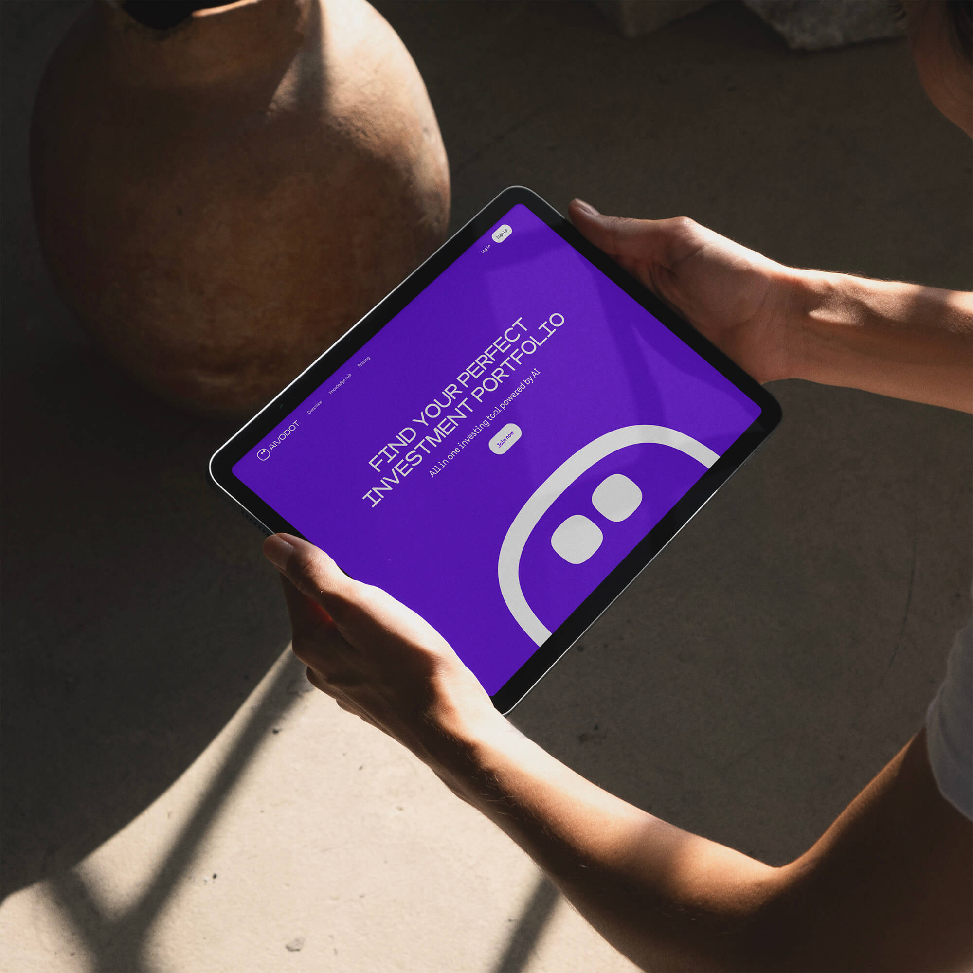

AIVODOT
Investment Tool from Luxembourg for Everyone
Aivodot is an investment tool made for everyone. Thanks to Aivodot, anyone can become a better investor and make decisions based on their values and beliefs. Wether you believe in renewables, European Union, or cyber security, Aivodot suggest the right companies based on your core beliefs.
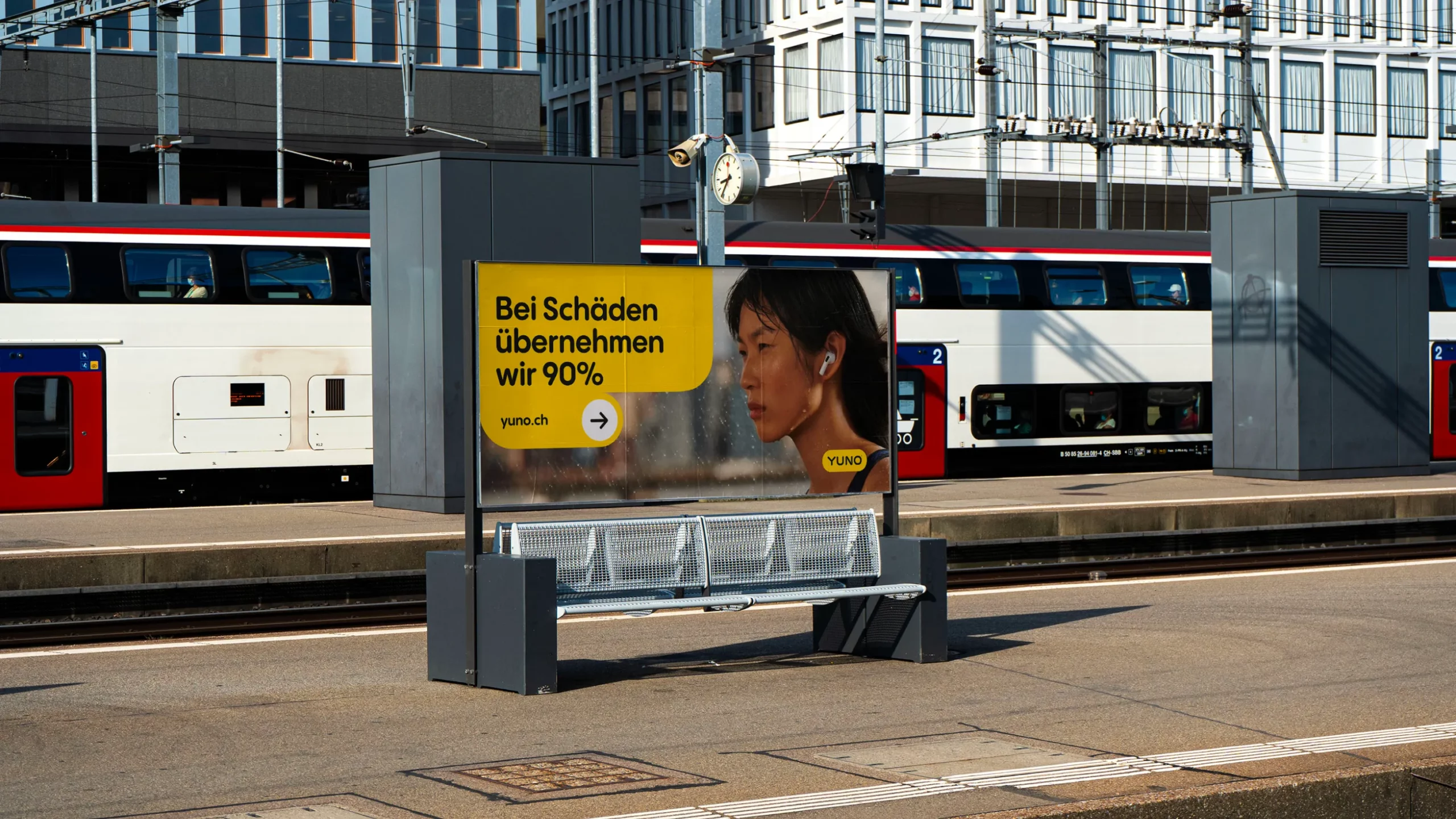
YUNO
Renting Newest Tech Should Be Accessible for Everyone
Yuno is a new service on the Swiss market that offers to rent the hottest tech products to their customers without any commitment and for a reasonable price. Yuno's visual language is based on a calendar shape from common design patterns of chosing a time-frame. The Calendar is not only a design element; it's a powerful brand asset. It seamlessly connects offline and online communication, embodying Yuno's core mission of flexible tech ownership.
BIOSYNTH
A Brand Refresh For The World Leader in The Field of Complex Chemical Synthesis
With offices and production sites in 7 countries, the acquisition of 4 companies was complemented by a fresh and consistent visual identity showing Biosynth’s edge of innovation. “The Edge of Innovation” idea comes from Biosynth’s business model. Biosynth is the only company in the segment connecting the product and service. The edge holds onto the logotype and moves around the canvas with it. Stretching the edge allows for unlimited layout possibilities.
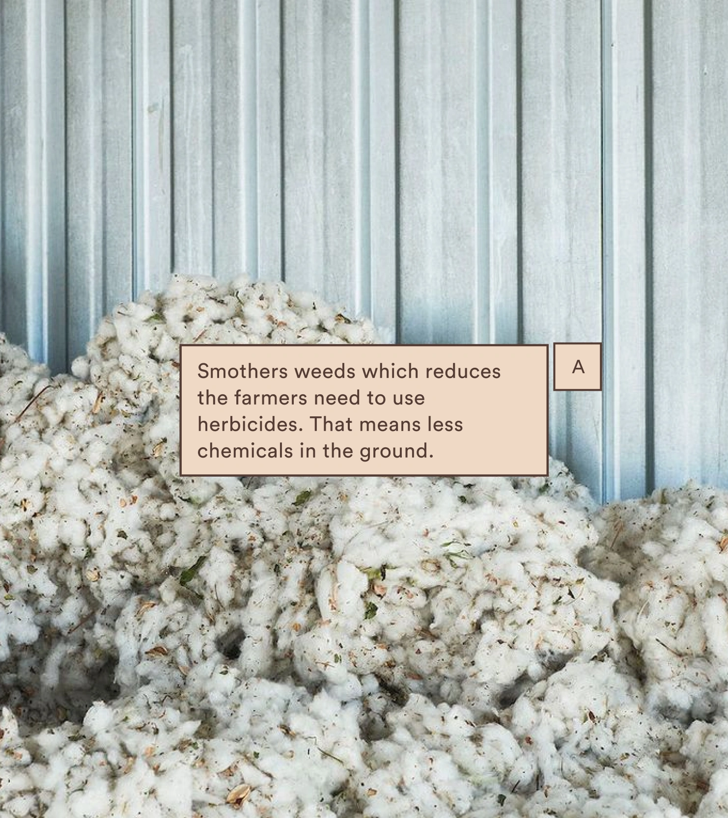
ORGANIC BASICS X WWF
Partnering with WWF® Turkey on Regenerative Agriculture
In 2021 Organic Basics partnered with WWF® Turkey to turn a conventional cotton field into a cotton field using regenerative farming practices. These practices don't harm the environment as do the conventional ones. We secured funding from donating a portion of each order during Black Friday. To grow interest and attention around the project, we built two websites. A landing page with horizontal scrolling about regenerative practices and a custom counter website that worked real-time based on the orders coming in. The goal was to convert 30.000m² of conventional land into regenerative practices. We doubled it.
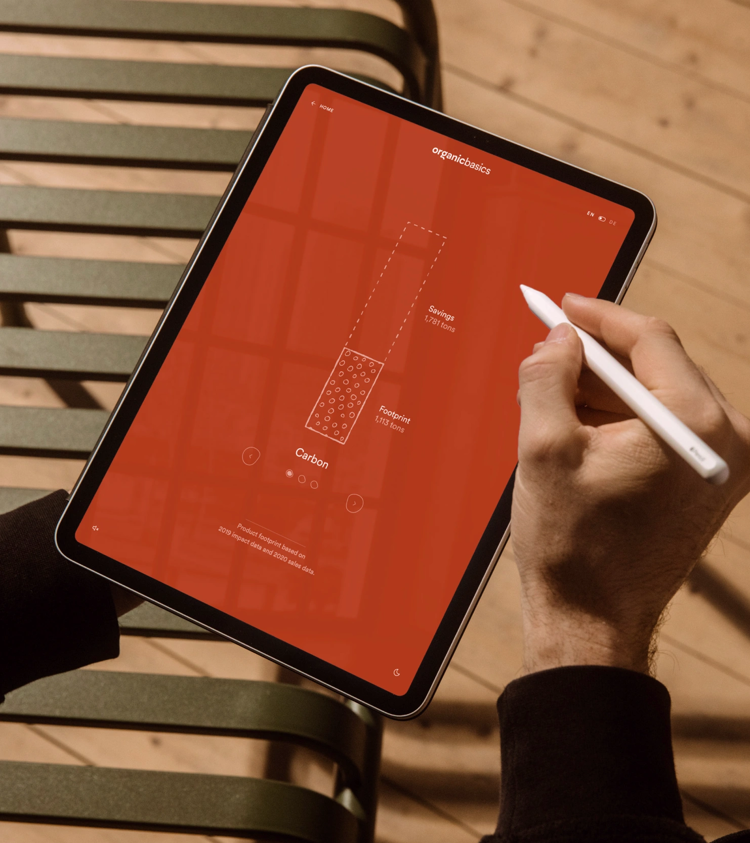
ORGANIC BASICS IMPACT REPORT
Environmental Impact Documented
At Organic Basics, I led a web project focused on designing and developing an innovative interactive impact report. Our goal was to showcase the company's impact in an immersive and engaging manner. We incorporated animated intros, captivating sound effects, and seamless integration of two languages to create a dynamic user experience. Moreover, we ensured the web app's versatility by making it accessible offline on any device. The end result was a visually stunning and informative platform that effectively communicated Organic Basics' commitment to sustainability and environmental consciousness.
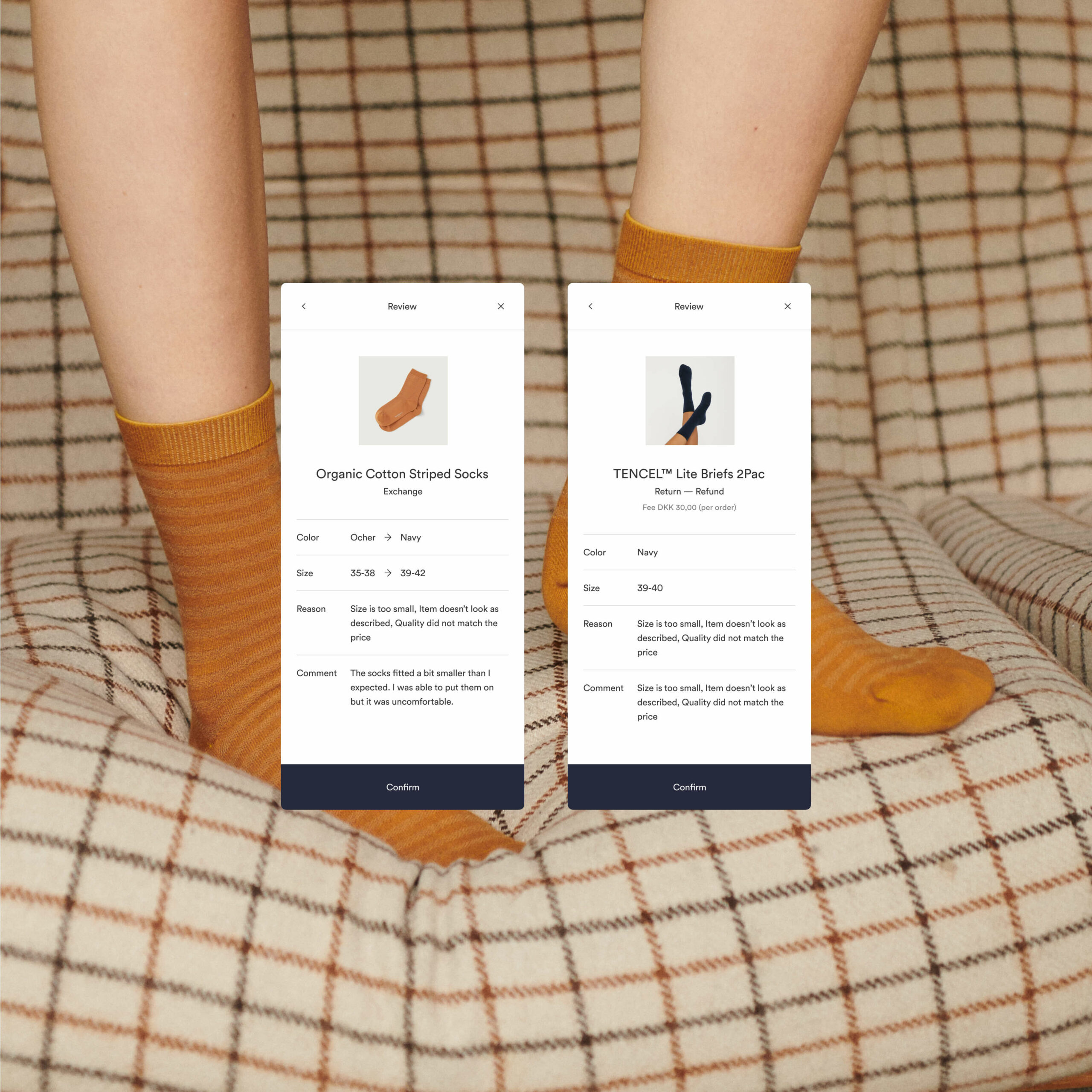
ORGANIC BASICS RETURN SYSTEM
Time Spent Handling Returns Cut by 80%
At Organic Basics, we were dissatisfied with the available solutions for our product return system and took matters into their own hands. We developed a proprietary solution in just two months. This in-house project, led by a team of three, allowed us to tailor the system precisely to our specific needs. The result was remarkable, as the time spent handling returns decreased by 80%. This achievement filled me with pride, considering there are entire businesses focused on return systems.
K2S ARCHITECTS
New Digital Home For Landmarks Of Nordic Wellbeing
Expressing landmarks of nordic wellbeing through digital experience. K2S Architects, led by partners Kimmo Lintula, Niko Sirola, and Mikko Summanen, is an award-winning architecture office renowned for its exceptional designs that embody Nordic wellbeing. With a deep understanding of context and a focus on Finnish roots, K2S creates resilient and functional architecture that offers unique spatial experiences. At e-Types, we created a digital experience that compliments one walking into one of the K2S' structures.
Let's talk and connect
Email → robert@tomanstudio.com