First, let’s start with a disclaimer. Organic Basics is a sustainable apparel company from Copenhagen, Denmark where I led digital design from 2019 til 2021. OB went through a repositioning and a rebrand in 2023. At that time, I haven’t been working in the company for over a year. The concept I discuss in the following article is from the live version I designed in 2021 and is available to see in my case study.
The Problem
Back in 2021, we were working hard on the new website for Organic Basics’ main e-commerce platform. It was supposed to be a big release but we were missing a key component. The brand strategy of the time was to communicate environmental impact of each piece of clothing across every touch point. We wanted to go as far as to have it next to the product price and inform the customer about the product impact. We believed in conscious decision making and by providing context to the product, we wanted to make sure that customers made informed decisions.
At the time, most of the competition weren’t transparent about the carbon impact of their products. Now it is more mainstream but back in 2019-2020, it was the early days. If there was a company showing the impact, they simply wrote it as “XYZ kg CO2e”. Since our strategy was to communicate impact every step of the way, only writing the number of CO2e felt like a missed opportunity.
The Solution. Brand Code — Symbol
The solution to the problem came to me during a walk on the beach. I know, sounds poetic. But it wasn’t. It was deep lockdown in Denmark and I was living alone in an apartment 30km away from my colleagues and friends. I always preferred living outside the city. But I haven’t accounted for a global pandemic. One of the ways I kept myself sane was to spend as much time outside as I could. I started to take a small notepad with me during my long walks and it struck me during one of those. It started with our symbol. The main equity-builder of the time.
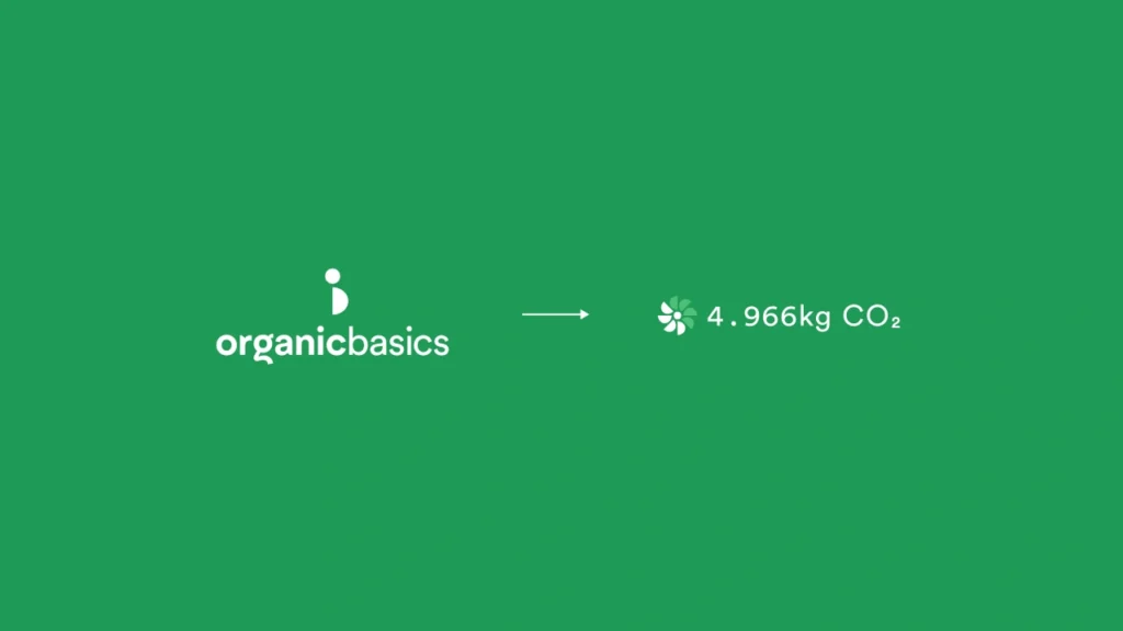
Our brand symbol was a combination of a circle and a half circle, stacked vertically, creating an abstract monogram of “OB”. Some of us called it a “pregnant woman” but the official name for the symbol was “The Friend”.

I got an idea to duplicate the half circle around the main circle to create a circular symbol. The idea was to use it as a scale for rating the environmental impact of our products. I loved the idea because that was the magic moment when the brand symbol became activated into a dynamic application that mattered.
As it happens, logos of the past era are often only static marks, helping us to identify the brand. But now, in the age of digital, we have to constantly challenge ourselves to look beyond the static form of basically everything. With the Organic Basics symbol, we were able to achieve it and make it more alive, yet functional.
Brand Equity & Education
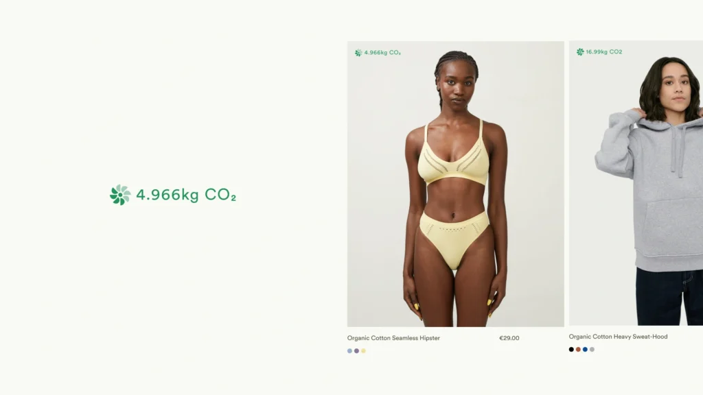
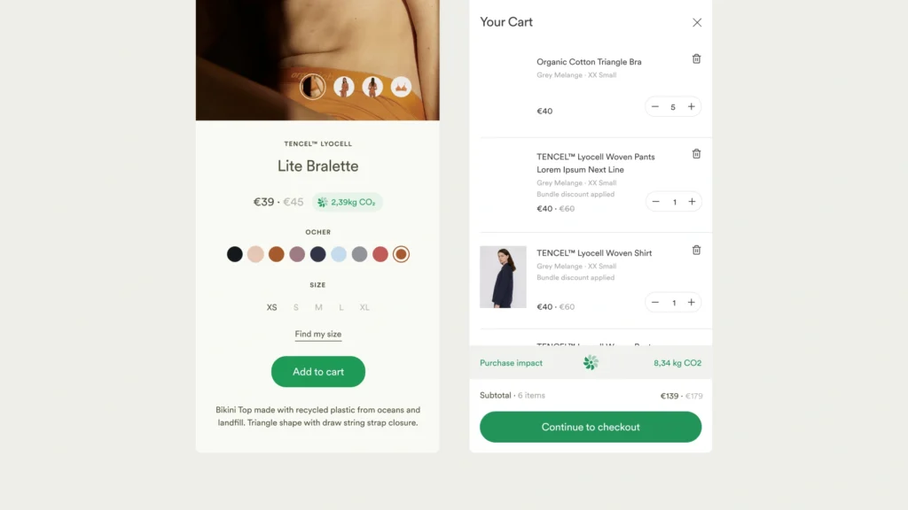
We applied the rating system, internally called “The Flower”, everywhere from the product cards, product pages, all the way to the cart. The simplicity of the symbol allowed us to animate it in code and make it interactive. But most importantly, we were adding the brand logo across every touch-point without being too pushy about it. You knew you were shopping at Organic Basics because the logo was basically everywhere. It informed you about your shopping decisions. We also managed to put it next to the price as it was originally intended.


When we were working on the concept, it was still early days of educating customers about environmental impact of the products. It was challenging for us to describe such an abstract concept to the public. When a house burns down, the impact is tangible. When a piece of clothing is made, it is harder to measure.
However, we knew the customer behaviour is changing. Our customers wanted to know more about the product. They cared about where it was made and by whom. The allegory of a “flower” was an attempt to bring the abstract concept of CO2 environmental impact closer to our customers and build brand equity at the same time. It’s a shame OB doesn’t use its proprietary system anymore. But that’s the nature of digital products. They come and go. They evolve and disappear.
The Organic Basics case study can be found here.
